Behind the Scenes: Incorporating Illustrations into Classic Novel Textblocks
How I Clean, Convert, and Place Vintage Artwork
Including original illustrations in a printable textblock sounds simple—just scan, drop, and print, right? In reality, it’s a delicate and labor-intensive process. Over time, I’ve developed a method that brings vintage images into my printable editions in a way that respects the original art and works smoothly in home bookbinding.
From Color to Black and White
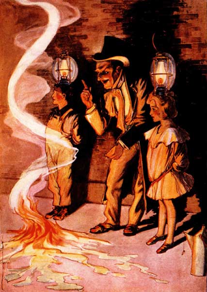
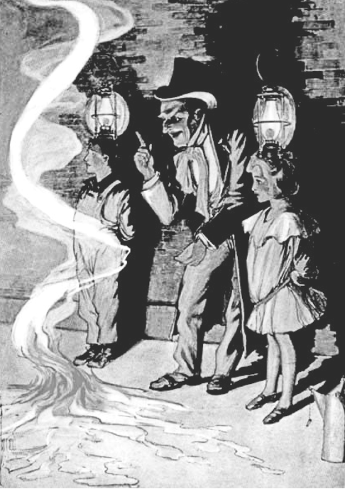
Many of the original illustrations I work with are scanned from early editions and come in full color (particularly in the Oz books). To make them blend naturally into the interior of a black-and-white book, I convert them to grayscale using Pixlr. But it’s more than just adding a filter. I often adjust brightness and contrast manually to bring out line work and tone down blotchy ink areas or faded corners. I also remove faintly colored backgrounds that give a grimy quality when rendered in black and white. It’s a fine balance between preserving the texture of vintage art and making it clean enough to print crisply at home, as seen in these illustrations from Dorothy and the Wizard of Oz.
Why I Don’t Use Color
The simple answer: printing in color at home is expensive. While full-color illustrations are beautiful, they can quickly eat through ink cartridges—especially when paired with detailed artwork, subtle shading, or aged paper backgrounds. Not only does color increase your printing costs, but it also introduces inconsistencies if your printer doesn’t handle tones evenly across multiple pages. By converting everything to black and white, I make these printable textblocks affordable and practical. You can print them using a standard black ink cartridge and still get charming, high-quality illustrations.
Cleaning Up Yellowing and Grain
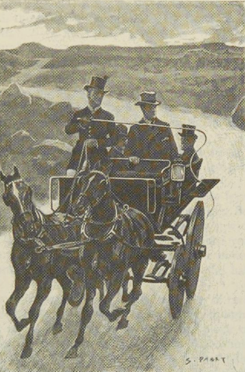
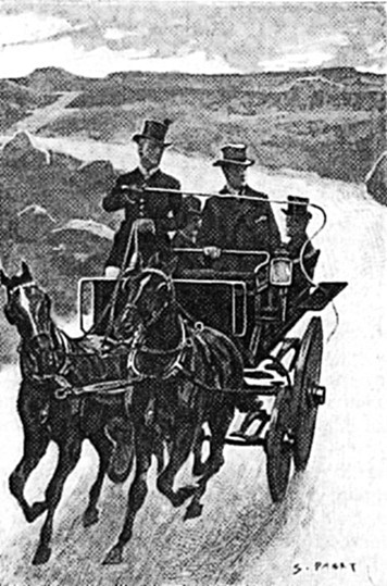
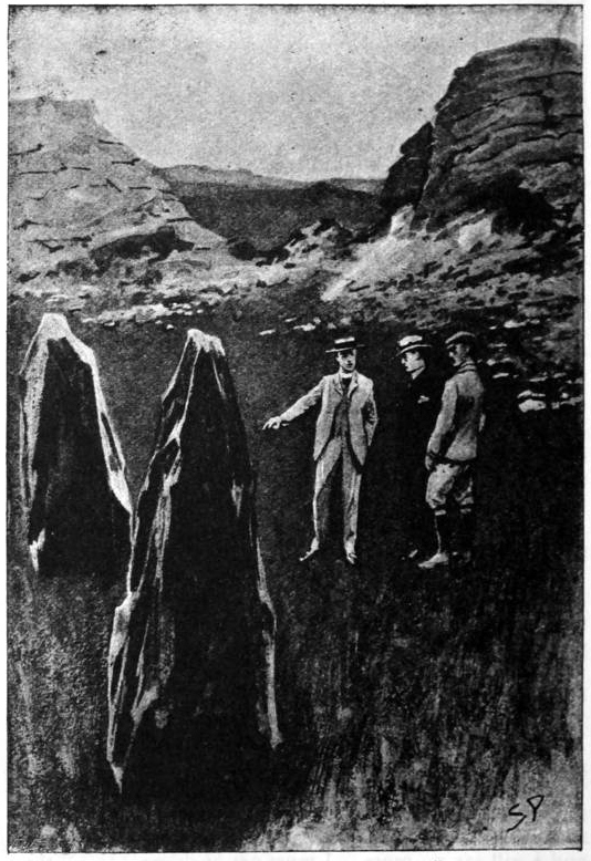
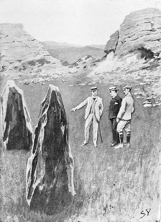
Old paper scans tend to have a yellow tint, grayish grain, or uneven inking, as shown by the original illustrations from The Hound of the Baskervilles. I go through each illustration—sometimes pixel by pixel—to remove spotting, erase scanner artifacts, and sharpen edges. This makes the illustrations feel intentional and refined, not like smudged relics dropped in for decoration.
Carefully Placing Images Within the Text
This is where it gets both tricky and fun. When I’m designing printable signatures each image has to be thoughtfully placed. Sometimes I’ll tuck an illustration between chapters to avoid throwing off the layout. Other times, I resize and position it alongside a key paragraph, making sure the flow of reading is uninterrupted.
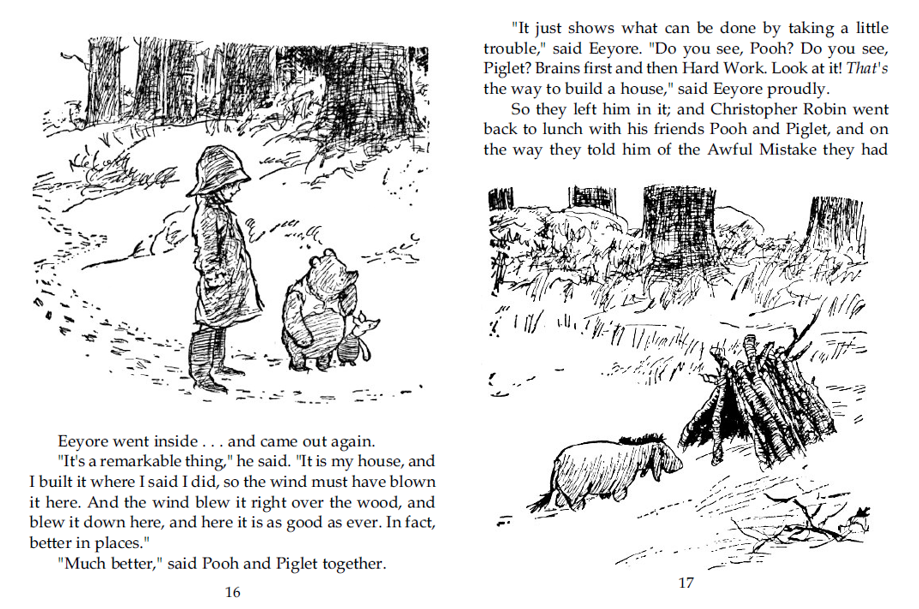
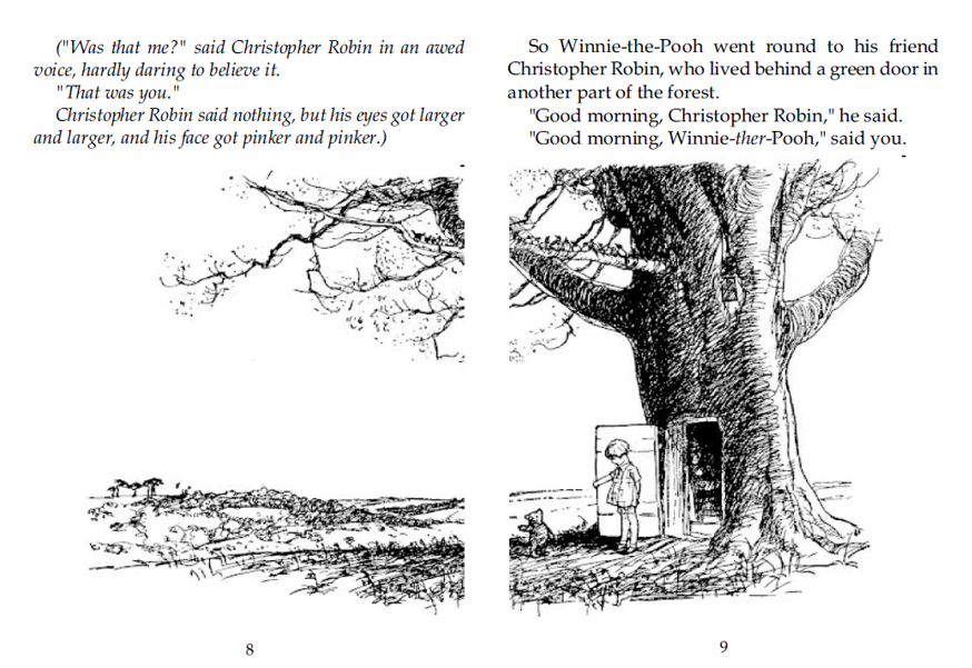
In these pictures, from The House at Pooh Corner, the text had be adjusted to keep the pictures in the correct placement over both facing pages.
The Final Result
The end goal is a printable, bindable book that feels like a small treasure. I want readers and bookbinders to open the pages and discover an experience that feels close to the original edition—but refreshed and thoughtfully designed for the hands-on world of modern bookbinding.
I include only those illustrations that have been carefully restored and can be printed without compromising print clarity. Whether it’s a whimsical image from Winnie-the-Pooh or moody shadows from The Hound of the Baskervilles, every piece of artwork is chosen and placed with care.
Looking for a printable edition of a classic novel that includes illustrations? Explore the illustrated textblocks at CGM Bookworks, designed specifically for home printing and handbinding—where every detail is considered.